Thursday, June 29, 2017

Interview with Councilman who wants to pull plug on mighty developer

So common has the idea become that council members are in the pockets of developers that it becomes front page news and attracts Fox TV when a councilperson wants to pull the plug on a development, even if it is just a gas station on steroids.  That the developer is a big player like Caves Valley, a major investor in Baltimore County and Baltimore City and the councilman in question is a Republican, makes the matter newsworthy, way beyond summer-lazy Towson.
First page headline: Towson gas station

A big storm cloud is now forming over the County's government seat because the fate of the very controversial mega gas station planned at Towson's norther gateway appears to be in jeopardy years after it seemed like "a done deal".
  • Will the County Council really pull the plug on the unloved project pushed forward by County Executive as a Planned Unit Development? 
  • Will the communities who opposed the proposed mega gas station at every turn for once get a win?
  • Will the Council adhere to the cherished principle of councilmanic courtesy in which all refer to the will of the district representative in matters just affecting one district or say good bye to it when it is applied in reverse to revoke a vote. 
  • Will the Council take the fairly unusual step of aborting a PUD?
  • Or will the majority Democratic council reject the lead of Republican council member Marks and vote for a deeply unpopular project to please Executive Kamenetz? 
The 2018 elections are already casting their shadow when the County Council will be up for (re-)election and the current Executive wants to become Governor..
Proposed development per a developer rendering published by the Sun
The turn of events must be pretty surprising for the developer since the full Council had approved engaging in a PUD which Marks himself had introduced last year, a prerequisite for any PUD by County rules.

The Royal farm complex with its mega gas station cannot be done under existing zoning because it prudently does not include gas stations as a permitted use south of Bosley Avenue. (There are plenty of gas stations beginning south of the bypass road.PUDs are supposed to allow better development, usually by  unifying zoning across several parcels. A PUD for a single parcel is already an abuse of the original intent of PUD as a planning tool but has become typical in City and County in part because the underlying zoning codes were or are antiquated. (The City just adopted a new code which is supposed to cut back the number of PUDs).

Rumors about Marks reconsidering his initial stand circulated in Towson since the beginning of June.

As early as 2013 the Council had also approved a land swap in which the County would sell its fire station lot at York and Bosley, build a new station  and still have money left from the sale, even
The site with the old fires tation and its trees before demolition
(Google Earth)
though the deal ruffled feathers from the onset because the new fire station, a few hundred feet down on Bosley, covered a green space. A gateway worthy mixed use project on the old fire station site fell through when the developer withdrew.

Second in line of the submitted proposals was a Royal Farm cum gas station project which Towson communities have opposed from the beginning as a very poor "Gateway" (the name of the project) into Towson. To this day the land sale has still not been fully executed. Residents became extra incensed when the County recently denuded the site of mature trees in a surprise action  which County officials described as "cleaning up the site in preparation of the sale of the site" without that the PUD had gone through all approval steps. A step that Republican councilman Wade Kach calls a "direct violation of the PUD" because stipulations of the Council that the trees should be preserved were part of the PUD  as introduced.

Mega gas stations under the banner of Royal Farms, Marathon, Sheetz or the like (depending on which region in the US one considers) have become a menace to good urban design and mar communities across the country in the same way as the endless proliferation of corner drugstores under the CVS, Walgreens  and Rite Aid flag. These uses create far higher revenues than most other projects and they all have a car-centric standard layout and design template that usually trumps local design reviewers or planning commissions.
Eye level view of the proposed Royal Farms project (Developer rendereing)

Because of the significance of Councilman Mark's action I asked him a number of questions. Here the full interview:

Q:  What exactly made you change your mind regarding the merits of this project?
From the beginning, I supported the review of the project and not necessarily the project itself.  There is a difference.  I always had concerns about the project, but hoped that the developer might be able to accommodate the community's issues.  Regretably, since the County Council passed the resolution in December allowing further review of this project, things have actually moved backward.  The turning point, for me, was the decision by the County Executive's staff to destroy 30 mature trees in clear violation of the County Council's mandate.  That was appalling and indefensible.

Ultimately, I withdrew my support for continuing the review because there was no public support, and because I do not want this project to be embroiled in litigation for the next few years.
Community protest against the Royal Farms project

Q:  Do you fear that this would set a precedent in which developers can lose trust in the PUD process if it can be ended without that the project parameters really changed?
The PUD process is supposed to emphasize public input and collaboration.  The lesson here is that smart developers should embrace those concepts if they want to take advantage of the PUD process.  Caves Valley Partners has done some good projects, but in all candor, this was not their finest work.

Q: What do you think about the principle of council-manic courtesy? Is it still something that should guide the council even on larger prominent issues? What speaks for and what against it in your opinion?  
I have consistently supported Councilmanic courtesy, and I hope my colleagues will honor this tradition that stretches back for more than three decades.  That tradition generally works.  If we did not have Councilmanic courtesy, you could have a situation where four Council members might override the district representative, and the voters would have no way to hold those four other Council members accountable.  We each know our own districts.
I have outlined numerous reasons why the process for this PUD is tainted--most prominently, the destruction of the trees, which removed a key hurdle for the developer.  I am asking my colleagues to look at the process.

Q: What are the chances of finding a better project for the site? The Royal Farm wasn't the first choice anyway, it was selected after the initially preferred project withdrew.  
Let's be honest--nothing will be approved here without community support.  We have another PUD in Towson, 101 York, that is of far higher quality but has been appealed for years because there is community opposition.  If the county re-bids this property, I have no doubt that a higher quality proposal would be found for this valuable piece of real estate.
We are nearing the end of the Kamenetz administration.  While the County Executive talks about revitalizing Towson, it was the County Council that did much of the heavy-lifting on key legislation that supported a lot of our redevelopment projects.  And it was the County Executive who blocked initiatives, such as a circulator, that a more progressive leader would realize is needed in Downtown Towson.  I am looking forward to that new leadership next year from the County Executive's office.

Community Architect Daily: Thank you!

It remains to be seen whether this cloud formation will rain on the upcoming Towson Fourth of July parade or actually further community cohesion.

Klaus Philipsen. FAIA

Related article on this blog about Towson Gateway

Recent Baltimore Brew article about councilmanic courtesy

Baltimore City residents opposing the Overlook development on Northern Parkway and Falls Road
which the Baltimore Brew used as an example of illustrating how councilmanic courtesy  can work
for a developer. 

Wednesday, June 28, 2017

Potomac bike lanes will stay

Just a day before the battle over the Potomac Street bike lanes in Canton would have had its second day in court after Bikemore initially winning an injunction against the removal of the protected lanes, Bikemore announced that it will settle the matter with the City. Late on Tuesday Bikemore's Liz Cornish posted this notice:
We have good news - the Potomac Street protected bike lane will not be removed! We will not be going to court tomorrow. Instead we have entered into a settlement agreement and will be sitting down this week with the City to assist in finalizing new plans for Potomac Street. We are confident this modified plan will preserve a high quality all ages protected two-way bike facility on Potomac Street, as well as safeguard public safety and accommodate emergency vehicles. (Bikemore)
Potomac Street Bikelanes in dispute and now saved
(photo: Philipsen)
Wednesday morning Bikemore celebrated the settlement in front of the courthouse at the battle monument on Calvert Street with about two dozen bike advocates and folks connected to the issue. The small celebration drew the attention of press and TV. Constructive collaboration usually goes further than adversarial trench war, especially with a new administration which just last week appointed a new Director of Transportation. Mayor Pugh had been quite outspoken about the fact that the installation as executed "was not properly vetted" (by the previous administration and her DOT department which had some design assist from Toole Design, a firm very experienced with bike facilities and complete street design, but apparently not consulted for the details of the disputed case.
Update: In a press conference later on Wednesday the Mayor released details of the settlement which include diagonal parking on one side of the street giving enough space for the bike lane and a decent drive lane to coexist. The impact on parking was not made available. The new design will be up for public comment in a two week comment period.

Liz Cornish, Executive Director of Bikemore considers the settlement "a win for making sure all are considered and not losing a bike facilty". Neither she nor pro bono attorney Mark Edelson wanted to discuss the details of the design compromise that will be established as part of the settlement before the settlement is signed. Edelson stated, however, that the basic principles of the solution have been agreed upon "otherwise we would be in court right now". From Cornish's online statement it is clear that the principles include that a two-lane protected bikeway will be maintained in both sections of Potomac Street and that their design complies with the standards of the National Association of City Transportation Officials (NACTO).
Attorneys Edelson and Stichel speak to WBAL
in front of the Court House on Calvert Street
(photo: Philipsen)

Councilman Ryan Dorsey who has submitted Complete Streets legislation was unsure what he could say about the matter since "technically I am part of the City which is the defendant in the case". But then he agreed to be in agreement that the application of the 20' fire lane requirement on Potomac Street was "arbitrary and capricious" since it hadn't been applied in cases were diagonal parking arrangements had left only narrow lanes in favor of additional resident parking.

Councilman Zeke Cohen called the settlement "a major win for our communities", he expressed "major thanks to Bikemore and the two pro bono lawyers" and added "tearing down a bike lane would have been catastrophic and had put Baltimore on the path of being one of the worst places for bike accommodation. He said, "it is a lane used by many people" and that "we need to think of bikes as part of a multimodal framework. It is a part of equity and a more equitable city."

While the exact details that will emerge from whatever settlement are still elusive, the following observations can be made:

1. The last minute discovery that the fire code presumably requires 20' clear width on a street so that fire apparatus can be placed to combat fires in adjacent buildings is an arbitrary application in the case of Potomac Street, since there are dozens of streets in Baltimore that have 10' single lanes between parked cars that have for decades not caused any fire safety complaints


Potomac bike lanes (Photo: Bikemore)
2. A strict and blind 20' free width rule across the city would cause excessive harm to historic districts and the burgeoning attractive tight quarters of the city. It would mean elimination of hundreds of parking spaces in dozens of streets across Baltimore and preclude protected bike lanes in many instances shown in the bike masterplan and require changes to already installed bike lanes.

3. Fire codes have in recent years been adjusted to account for historic buildings, urban conditions and adaptive reuse of existing structures. In many cases compromises have been made on minimum stair width, riser heights, hallway width and the like since fire codes made for new construction would have rendered many older building unfit for re-use and rehabilitation.

4. Excessive fire code requirements for turning radius and lane width have been for years subject of compromises even in the layout of new subdivisions because they prevented the layout and dimensions  of more traditional developments favored by New Urbanists. Many jurisdictions have adjusted the National Model Code accordingly

5. Potomac Street is a somewhat problematic poster child for protected bike lanes. It is a low volume neighborhood Street with a relatively narrow section in the northern part of its run. In the future it would be prudent to install protected bike lanes in a more comprehensive approach that includes traffic calming, street greening, urban design and practicality of use for all participants.
Bicyclists celebrate with doughnuts and coffee
(Photo: Philipsen)

6. While bike accommodation is much cheaper than other traffic measures, if  done too cheaply and hastily and solely by striped bike lanes and flex posts it can present a challenge in the longer run challenge. Protected bike lanes in Europe are usually part of the sidewalk area and not part of the section between curbs or they are entirely outside of streets. Urban design considerations, landscaping, storm-drainage, snowplowing and street sweeping need to be included into the considerations to obtain a long-term sustainable solution.

7. Without well organized advocacy even the smallest bit of progress would be annihilated by NIMBYs.

As councilman Cohen pointed out, making a city more bike and pedestrian friendly is an important piece of making a city more equitable, healthier and having a higher quality of life. The increasing popularity of electric assist bikes similar to the ones used by Baltimore's bike-share system can expand bike usage way beyond the initial bike advocacy constituents and make the bicycle a serious contender in the "arsenal of inclusion" that offers a variety of mobility choices even to the young, the elderly or the frail who have no access to cars and often have only poor transit.

It is very important to get this right, so a lot is riding on the this Potomac Street settlement. Pun intended!

Klaus Philipsen, FAIA

Baltimore SUN

Tuesday, June 27, 2017

How do Link buses really perform?

The several hundred angry bus riders who assembled Monday night at the War Memorial Hall certainly didn't think the buses do well. Organized by the transit union ATU this was an early venting session, presumably to take rider anger away from operators. The assembled MTA customers didn't like the new route names, the transfers and the confusion from all that change. Specific complaints ranged from buses not arriving to missed appearance at work and dangerous late night transfers, especially for women. The biggest applause line was the request to bring the old routes back.
"Ask your grandmother to use the pink bus", this woman
shouted, apparently assuming that this was too much to ask

Kevin Quinn, who totally unexpectedly got catapulted into MTA's driver seat less than two weeks before the Baltimore Link launch, took the shouting in stride. "Baltimore deserves better", he promised. In another meeting with business people at the Greater Business Committee earlier after the launch the atmosphere had been friendlier and Quinn had cautiously allowed that the roll-out had gone pretty smoothly. Now he proposed additional early morning buses and other tweaks.

What are the facts? Is the new bus system better than the old one? This is hard to assess for observers or riders. Riding the bus to work gives snapshot information about buses being late or bunched, about wait times at transfers and the overall duration of the trip, but one cannot extrapolate from one trip to the route performance or from one route to. A city like Baltimore with its 740 buses and now 55 routes is hard to assess within a few days unless a precise measuring system has been put in place up front. No such system analysis is available yet and it isn't entirely clear whether the MTA has set such performance measures already in place.
Panelists included Kevin Quinn, MTA Administrator, ATU members and
Transit Equity Coalition member Sam Jordan (with hat)

Another method is observing a particular hub and time all buses comparing actual times with the schedule. That provides info for several routes at once but only in one location and for a particular time slot.

I did this on the morning after the hearing in a very limited way at West Baltimore MARC observing 6 routes for an hour, followed by a shorter observation of the Gold Line at Penn and North which is also served by the #85 and the Lime. I saw only one Lime going north in 30 minutes and none south. I observed two #85 buses going north but those observations may have been incomplete.

Overall, out of 46 scheduled departures and 9 routes 4 bus runs seemed to be missing, four buses were more than 5 minutes late (max 10 minutes)  and all the the others were within the 5 minute window of being "on time". All routes had 10-15 minute headways except one (#77). This doesn't sound too bad, really, but again, its only a snapshot.

Essentially riders and transit advocates need the MTA for a systematic assessment of performance, they have all the tools such as on-board vehicle locators, a command center and many on the ground transit observers.

As Brian O'Malley of the CMTA observed on last week's Midday show, an assessment would be much easier if the MTA had established clear performance metrics that could be used to compare the old system with the new and gauge progress on the new over the initial weeks. Obvious performance measures are # of households served within a 1/4 mile of any regularly served bus stop before and after, # of jobs before/after , trip times on important high ridership routes (Like comparing a trip on the #13 with one on the Gold Line) and schedule or headway adherence.
Applause for those who demand reinstating the old routes

A few conclusions can be drawn after the first ten days:

1. The local link routes which often run like short trip shuttles to the City Link color routes perform pretty reliable but don't get most people to their destination, instead they drop riders off  to catch a connecting bus on one of the color-coded "high frequency" routes.

2. People don't like the color coding of the CityLink buses because they require a total re-learn even if a bus largely runs on a familiar route. 12 colors are too many to be easily memorable or easily distinguishable The Blue, for example, mimics the old QB 40 pretty well except it has more stops and doesn't extend from CMS to Essex but only to Bayview.
Palatable anger in the hall

3. The high frequency CityLink lines are still exhibiting the same weaknesses the longer old routes showed, namely bunching, i.e. clustering in packs instead of adhering to the 10 minute head-ways that many lines promise during peak hours. It isn't clear what measures MTA has in place against bunching. It is especially surprising to see two OR buses start their route at WB MARC within 1 minute right from the onset in spite of several bus supervisors being in place observing the procedings.
Protest makes headlines: WBAL news on Tuesday morning

4. Initially operators were less sure about their routes than desirable. Stops were skipped or wrong information was given to riders who take their bus driver as the most obvious source for information. It didn't help that the operator union, the ATU continues to shout from the sidelines instead of doing everything to make the system a success.

5. Key new tools like the large real time multi-line arrival signs were not operational at the start and are still in test mode.

Here the details from the West Baltimore MARC bus hub:

The hub is serving the Blue, Pink, Green, and Orange City Link lines and the #77 and #78 Local Link Lines. The #26 runs on nearby Pulaski, the #80 bus on Edmondson. Both were not observed. The #150 Express bus serves the hub with three runs each morning and evening. The color lines are supposed to run in the morning peak at 10 minute headways, The OR line changes at 8:30 to 15 minutes. The #77 runs on 20 minute headways and the #78 on 15 minutes.
New bus hub at West Baltimore

In 60 minutes 32 buses departed from the new hub, i.e. slightly more than a bus every two minutes, a pretty strong presence of transit at this particular interchange where folks can transfer to the MARC commuter trains to BWI, Odenton, New Carrollton and DC, all job centers.

Of course, many riders jump from one bus to another and have to find their connection, something that previously didn't happen here since there wasn't a bus hub at West Baltimore, just MARC parking lots.

In spite of the amenities, riders may not consider this need for transfer an improvement. There is still some confusion about where the various colors have their departure bay, especially when the hub is congested and the assigned bay is blocked by a delayed bus.

The hub itself features a ticket machine like a LRT station (one still can't MARC tickets there), a covered bike rack, artwork and three electronic display-boards able to list all departing buses for at least the next 30 minutes, all features previously unknown in MTA's bus system. For operators there are even bathrooms.

The results for the one hour of observation:

BL eastbound (Bayview): The 8 am bus was not seen and either was early, never came or all subsequent buses were 10 minutes offset. The other 5 buses of the hour showed up 7, 3, 4, 4 and 0 minutes late.
The westbound BL used to stop at the old Ice House but
is now directed through Smallwood Street to stop along
the curb, then loop backwards via Mulberry and
Pulaski out to Franklin Street. This maneuver costs
valuable minutes

BL westbound (CMS): The 8am bus was seen pulling out at 7:57 but it could have been the earlier one. The next buses for the hour were 10 minutes late, 1 minute late (i.e those two were bunched), and 6 minutes late. The last bus at 9am was not observed before I left.

PK buses originate here (Destination: Cedonia). No 7:56 bus was seen. The following buses at 8:06, 8:16, 8:26, 8:36, 8:45 and 8:56 were all on time.

OR buses originate here. (Destination: Essex): The 7:55 left at 8;59, the 8:05 at 8:10, the 8:15 left at 8:11!), the 8:25 at 8:29, the 8:35 left at 8:32, and for the 8:45 and the 8:55 there was only one departure at 8:58.

The #77 ran on time and the #78 left 6, 3, and 3 minutes late until it skipped the 8:39 and then had again a departure 3 min late at 8:57

It is possible that I overlooked a bus, but I also noted all the arrival times as a cross check and am pretty sure that the missing blocks actually didn't show up.

To round it out, I also checked on the Gold line on North Ave at Penn Ave.  for 30 minutes from 9:05 to 9:35. The schedule mentions vaguely "10-15" minute headways for the time after 9am.
New displays are placed at the hubs

The eastbound Gold (Berea or Canton Crossing) left at 9:08, 9:13 and two buses at 9:35 and 9:36 leaving a 22 minute gap.
The westbound Gold (Walbrook Junction) at left at 9;15, 9:25 and 9:35, pretty good compared to how badly the #13 usually did.

Klaus Philipsen, FAIA

I apologize for any reporting errors in this unscientific sampling

A peak into my notes taken on site

Monday, June 26, 2017

How successful are the Baltimore Link graphics?

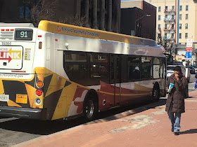
While experts will debate for a while whether Baltimore Link is going to be a success or is just a repackaging of the same old problems of unreliable, bunched buses that don't always go where one needs them to go, the new livery and graphics can be assessed as they are now.
The Maryland flag, the theme for the buses

For sure, in the big scheme of things, riders wouldn't consider the bus colors, the color of the seats or even the design of the bus stop signs as overly important, especially if the basic services turn out to be a problem.

But given that transit is an important part of the iconography of metropolitan areas  and that this blog is centered around architecture, design and urban issues, the most visible part of MTA's new bus system deserves a second look, especially
Baltimore flag
since the MTA transit planners themselves considered design and branding important enough to make it an integral part of the heavy lift of their June 18 Baltimore transit revolution.
The elements of the MD flag on the Local Link bus. The roof rail shows
various shades of yellow

With Paul Comfort fired less than two weeks before the launch of Baltimore Link the personification of Baltimore Link and the dynamo behind all the changes is absent now to speak to the issues. Without him it is difficult to see why it was necessary to repackage 750 bus 5,000 bus stop signs and  hundreds of schedules and maps, websites and even the LRT vehicles all without having enough money and resources to even hire graphic designers. Much of what was done with the graphics was nevertheless positively received chiefly because of enthusiastic in-house talent which worked creatively to make the full branding overhaul happen. There was also a lot sounding off MTA staff in the decision making process with dozens of stop sign variations up for comment..
City Link colors: No clear yellow and a bleached red

Especially the new radial system map designed by Marc Szarkowski of MTA is widely lauded as a creative new way of depicting the bus system.

Now that the heavy lift of reorganization of the bus system is in effect and the sun is still rising in the East, the graphic redesign isn't regarded any longer as one of a million things that needed to be
The line above the windows is painted and not taped and presents a nice
bright yellow
done by an incredibly tight deadline, but as something that needs to pass muster for years to come.

Schedules, routes and bus stops can be tweaked, but the graphic design will have to be what it is for some time.

There are a few observations that point to some weknesses and self made problems:
Iconic Berlin double decker buses in yellow and black
  • Blue as a transit color is deeply entrenched in MTA's history and people's associations with the MTA. (even though, historically, Baltimore transit has had many colors). Still, the departure from blue is comparable of Coca Cola selling their Coke all of a sudden in blue-green-yellow cans instead of red ones.
  • A new branding scheme that would have included blue in some form would have been easier to implement. An example is the New York MTA, their traditional blue and their new bus design ire-incarnation. The complete departure from previous color schemes means that the blue of old has to be eradicated down to the last corner which is very expensive and energy consuming. 
  • For example Metro and Light Rail used the old MTA blue not only on their vehicles but on station signs, pylons, ticket vending machines, seat colors and station architecture such as shelters. Even mobility vans need a redesign.
    MTA's new bus stop signs are full of
    good information but lack the graphic
    clarity  to become icons in the landcsape
  • Since Maryland's and Baltimore's flag share black and yellow it would have been easy to stick with those two colors, but MTA decided to add the red of the Maryland flag into a three part color scheme that from the onset created more complexity  than is probably advisable for effective transit branding. A fairly convincing yellow and black bus design can be found in Berlin, Germany. Those buses are iconic and hard to overlook just like London's red buses.
  • The three new bus colors are not paint applied but consist of vinyl wraps that are applied over the basic white bus body, a method that began with bus advertising. That is cheaper than paint but adds the basic white as another "color" and doesn't allow solid colors in the same way paint does. The vinyl tends to fade and blend with the color of the substrate. Plus, for whatever reason, MTA selected to transition each color from a saturated tone into mixes with black that look murky at best and add even more variation.
  • Further complexity comes from the fact that the Local Link and City Link buses come in different flavors. Additionally, the various coaches have different shapes and surfaces so that the surfaces for
    the various colors vary as well, depending on the
    London's iconic stop signs
    model year and whether it is a standard 40' bus or an articulated bus. Lastly, advertising taped over parts of the multicolor dreamcoat adds additional clutter.
  • The bust stop signs apparently weren't tested in an actual urban setting and were also subject to cost restraints. Originally envisioned as flag signs so that the front and the back could carry information (riders approach a stop from either side) which could be larger than the old signs and still maintain the required 18" curb distance, the signs are the same size as the old signs and screwed onto the same old unsightly perforated knock-away posts that much more often lean than stand straight. As a result, the new signs which carry a lot of useful information are very hard to make out from some distance and have no info on their back.
  • A more elaborate bus stop sign for prominent high traffic areas such as transit hubs like the West Baltimore Station was eliminated for cost reasons. Successful bus hubs have real time displays on each bay  with clear bay designations and route numbers so one can see from a distance where to go without having to walk up to each bus stop sign. 
  • The printed schedules and maps are much better than before and show what MTA can do with its in-house graphic abilities
    The new colors of Baltimore light rail
There are other elements that round out Baltimore transit in the urban landscape, some are new: Red bus-only lanes on various downtown streets, new coaches with fire-red seats instead of the previous blue seats and LCD displays screens that can hopefully one day show the route and upcoming stops. There is also a slew of additional shelters picked from the black framed shelter design pallet with clear glass which was previously in use, a ticket vending machine for buses only at the West Baltimore bus hub, the West Baltimore bus hub itself which joins Mondawmin as a second central bus facility, and large electronic real time bus departure signs at Mondawmin, Penn?North and West Baltimore.

New York MTA: new bus colors
Hindsight 20/20 isn't very helpful now, although one can't help to think that riders would have an easier time if they would have been allowed some graphic continuity here and there.

Small graphic improvements improvements, especially signage in the transit hubs, should still be possible and considered.

The wrapped buses, though, present a large temptation for another administration to once again tinker with the colors of Baltimore's transit. 

Klaus Philipsen, FAIA

See also: The changing colors of the MTA

The creative new regional bus map highlighting the radial Baltimore development pattern


WMATA bus color plan


Traffic enforcement as a way of restoring civility in Baltimore

With all the demands and unresolved issues that are pushing in on the new Mayor, the matter of speed cameras wouldn't be expected to make the top of the list, but alas, today the first radar traps are installed and active. Record speed for the standards of City government, ironically in the interest of slowing down.
New mobile version of speed cameras starting operation
June 26, 2017
The red light camera program in Baltimore launched June 26, using 20 speed limit cameras (10 in fixed positions, 10 portable), 10 red light cameras, and as many as six cameras that will enforce commercial truck regulations. The initial installation includes only the 10 portable cameras, additional locations will occur later this summer. The last time speed and red light cameras were active in Baltimore was in 2013 when the program was ended because of irregularities how speed was measured and cameras were calibrated. 
During the first 30 days of the new 2017 program, drivers will receive warnings. $40 fines will be assigned after that time. Baltimore’s Department of Transportation will employ an ombudsman to help drivers appeal citations so that they can avoid court appearances. The Mayor's approved budget includes $5 million revenue form cameras. The cameras will be installed and operated by two different vendors. There will be a third, independent vendor to monitor the program.
 While many may think that slowing down traffic shouldn't be a high priority in a City where nearly one person a day gets murdered and the opioid epidemic kills two additional people a day and where 19 people died in Baltimore fires this year alone, there are many good reasons to pay attention to the increased crash rates on Maryland's and Baltimore's roadways.
Driving as if there is no other person in the world

Traffic behavior can be seen as a proxy to the state of lawlessness that is acceptable in any given geographic area. Everybody has experiences of particular places where pedestrians never walk against the red light, where drivers never run through lights after they change to red, where drivers stop for pedestrians in crosswalks and where speed limits in residential areas are so low, that even a kid running into the street unexpectedly would have a chance to survive. Some of these places exist in the US.
"I have no problems with a speed camera program. I have constituents on some roads who are dying for them to come back," City Councilman Brandon Scott
Of course, people who walk, ride bike, drive or operate a bus in Baltimore would never name their own city as such a safe and considerate place, it is common practice to think that behavior is particularly bad in one's own burg. But the numbers for Baltimore bear out that traffic safety here is really bad. In an Allstate study about crash claims in America's cities published by Forbes in 2016 Baltimore is the third worst city in the entire country after Worcester and Boston, both in Massachusetts. In another study which ranked also cost and congestion, Baltimore ranked #95 on a 100 city list of where it is best to drive.

Crash statistics for the City are hard to come by (much easier to see for Washington, DC, for example) and most date back to 2015. The numbers indicate that Baltimore City is one of the unsafest environments for pedestrians and bicyclists in the State but that the death rate from traffic accidents is lower than that of fires, another unfortunate Baltimore statistic.
spectacular crash next to City Hall

Even if one doesn't want to trust those lists, daily experience provides stunning experiences regarding what pedestrians, drivers and bicyclists experience on our streets on a daily basis: from dirt-bikes with masked riders zooming by rush hour traffic on busy streets, to cars passing on the right to then blatantly go through a light that has already been red for a while, to droves of car failing to stop for people that line up at a marked but un-signalized crosswalk.

Of course there are the bicyclists zipping down sidewalks, the pedestrians that run into the street anywhere and anytime, no matter what. But no doubt, the infractions are most dangerous when they are committed by drivers who often sit in oversized or overpowered vehicles to instill fear in their fellow citizens on purpose. There are the speeders that go 55 miles an hour on Martin Luther King Boulevard, Orleans Street or Edmondson as if those streets were freeways. Those who honk and yell at bicyclists or clip them within inches to make them fear for their lives. There are those who on a rainy day, without mercy or consideration, rush down those rush-hour lanes, wheels hard against the curb and gutter, throwing entire walls of water against pedestrians waiting at a bus stop . Those who rev up their engines to the redline RPM between speed humps and even those who push your car over like in bumper cars in order to change a lane and gain a second, apparently not minding that their sides get scratched in the process, they just take off their licence plate invisible behind a grey plastic sheet and their faces unrecognizable behind darkly tinted glass. The really rogue drivers run over police officers who want to stop them and outrace pursuing cruisers only to end in spectacular crashes mowing down innocent bystanders.
Speed camera location 2017

In short, lawlessness on Baltimore Streets is high and it cements a sense that civility isn't a virtue in Baltimore. In fact, behavior is contagious. A single speeder can entice a whole platoon of drivers to go faster.

It isn't really a stretch to see a connection between lawlessness in traffic and lawlessness in general. It is like in the much maligned broken window theory: If you can get away day after day with taken your SUV as a weapon to terrorize your fellow citizen, it may well instill in you the notion that you can also get away with shooting a motorist in the course of road rage or brandishing a gun anytime something doesn't go your way. It isn't unreasonable to see the street as a place where people are being socialized either in courteous and considerate behavior or in the "me first" view that knows no consideration for others. If the latter goes unpunished for too long, it becomes the norm.

Facebook Posting
On Facebook some have decried the program as racist  based on the initial locations of enforcement published by the City. Others consider it an additional tax in an already high- tax-city and question that the program is about anything but money.

A look across the country or even around the world shows that other cities are well ahead of Baltimore when it comes to increasing pedestrian and bicycle safety. Many European cities have 30 as a speed limit in all their neighborhoods 30km/h, not 30mph, that is under 20mph! All other urban roadways are usually limited to 50 km/h which is 30mph. Enforcement there is strict and includes ticketing pedestrians that walk on red.
Mayhem on the streets: Crash rates are increasing

Therefore, it is a good thing that this administration is paying attention to traffic safety on Baltimore's streets. Whether it is the dirt bike task force that is confiscating illegal bikes, or that the Mayor decided to put radar traps and speed cameras near schools and areas where children are to be expected.

It is high time that police pay attention to those who flaunt all laws. Recreating civility and consideration on the road is an important step towards making an entire city more livable and wrestle daily life back from those who think they can terrorize everybody. Certainly traffic enforcement is no substitute for addressing the City's many social pathologies and inequities.

Klaus Philipsen, FAIA

Friday, June 23, 2017

McKeldin Plaza: The sad case of diminishing expectations

After much debate and back and forth McKeldin Plaza opened Thursday without fanfare but in presence of the hapless descendants of the former Baltimore Mayor McKeldin who were trotted out to legitimize the travesty of demolishing the fountain that carried his name since 1982. McKeldin is still well regarded for his ability of seeing 30 years ahead in his then stagnant burg and envisioning a lively waterfront.

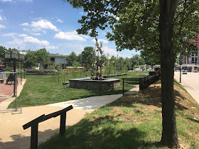
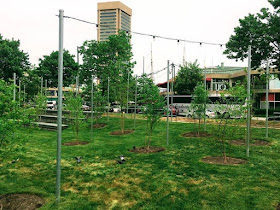
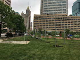
What was revealed after the veiled 6' chain-link fence came down is that the full throated tiger Downtown Partnership has fathered a mouse. McKeldin Plaza is now so mundane it wouldn't raise an eyebrow in downtown Arbutus. A bit of grass, a few skinny trees and a 5' perimeter walkway are not able to cover the gaping hole the $4 million demolition of the brutalist fountain left behind in Baltimore's landscape. Strings of light and recovered shiny art round out the decor that would even be able to enhance a Bavarian beer garden.
The new McKeldin Plaza: grass, trees and berms (Photo Philipsen)
“This is where Baltimoreans come to celebrate holidays and watch parades. It’s the town square where civil and political opinions are expressed. This new design makes the space better for all of these activities. It’s placemaking on a human scale.” (Kirby Fowler Press release)
The only thing the new plaza can claim for itself is that there is no concrete left after fountain and bridges have been removed with much effort and so many dollars that nothing was left for the new design. A plus for those who hate concrete and confuse brutalism (Béton brut) with brutality; to avoid even a speck of concrete, rock caged in chainlink, "gabions" typically used by engineers to stabilize eroded river banks, forms little walls here and there. Not being a brutalist fountain is hardly enough of a program for one of the most prominent parks in Baltimore.
The fountain that allowed walking through it and was clearly part of the
Inner Harbor design

This is a very disappointing outcome if one cares to remember the promises with which it all started and which were taken back one after the other: As shown in ASG's Harbor 2.0 masterplans, the promise was to connect McKeldin Plaza to Harborplace by closing the four lane traffic connector that slips northbound Light Street to Calvert and eastbound Pratt.
Imagine what Art History would include if all the ‘ugly’ art was destroyed by the haters of their time? Pretty much all of it. Every piece of historically significant art has been hated by a contemporary audience in its day. (Cara Ober in Bmore Art May 2015)
The idea of closing those lanes gave traffic engineers hives and was referred to lengthy study conducted by Sabra Wang, a consulting firm where several other hot traffic issues went to die, probably less the consultant's fault than the fact that Baltimore's DOT has been largely rudderless for years.

With the expansion promise gone, the justification for demolition of the fountain was gone as well. But it turned out that the closure of the dogleg was nothing but a pretext for those intent on knocking the fountain down, come hell or high water. It was the money from the owner to the west who looked across the street against the fountain's pump room door spoke.
The original Ziger Snead/ Mahan Rykiel redesign of McKeldin
Plaza

Now the promise shifted to "world-class park design" on par with Chicago's Centennial Park. In July 2015 a Downtown Partnership representative introduced the design concept to UDARP in this lofty but accurate assessment:
"DPoB believes that McK Plaza is the maybe the most important civic space. And if it isn't it has the potential to be it". 
But the design of the hand-picked homegrown design team of Ziger-Snead and Mahan Rykiel was met with scathing  comments from the local design review panel UDARP which didn't find anything "world class" in the proposal. Panelist Richard Burns likened the proposed water wall to a hotel lobby design ("I have seen this at a Marriott") and determined that nothing about it was specific to Baltimore.

In response DPoB suddenly scuttled the design and there was whispering about a design competition. Another ruse. DPoB saw a chance to knock the fountain down and then do almost nothing. In a special kind of irony, UDARP panelist Rubin gave a hand in the design of the temporary fix that is now on display, either a blatant violation of the rule that panelists can't design what they critique or abuse of a very capable designer. Rubin, an excellent and sharp critic, a Harvard trained landscape architect, couldn't win when confronted with Fowler's budget that never included more money than what was needed for the costly demolition.
Gabion stsyle walls and bling sculptures (photo: Kevin Lynch)

Exactly a year ago I wrote this on Community Architect Daily:
The new zoning code prohibits the demolition of buildings before a replacement is designed, approved and funded. It isn't clear why that logic shouldn't apply here, too. What could possibly be worse than a half-baked underfunded provisional open space? 
The current fountain has the heft and scale to holds its own in a sea of traffic. The cascading water provides a sound that neutralizes the traffic noise to some extent; the steps, bridges and structures make it a walkable big sculpture and offer many surprise views,  The illumination at Light City Baltimore showed how easy it would be to spruce the fountain up, especially at night. No doubt, a better design is possible, except it hasn't see the light of day, yet. McKeldin Fountain in its current form is an important public space and its disposition should not be left to private entities, no matter how laudable many initiatives of DPoB are or have been.
The new McKeldin Plaza: Bling and shrubs (Photo: Elliott Plack)
Of course, what we have now is precisely that,  a half-baked underfunded provisional open space easily outwitted by the new temporary Sandlot park at HarborPoint. As if DPoB wanted to make sure that even more energy travels east on Baltimore's waterfront. In spite of the designs flatness, the surrounding walkway isn't even accessible when it ends in a sudden a dangerous double step.

Kirby Fowler will tell concerned citizens not to worry, the real design is yet to come. Why should anyone believe this? It is well established that temporary solutions are the most enduring. They better be really good to start with.


Klaus Philipsen, FAIA
A poorly drained 5' perimeter walk has all the charm of a suburban sidewalk  (photo: Klaus Philipsen)

What to do with these lawns, another suburban design staple  (photo: Klaus Philipsen)

a few tiered benches suggest that there would be something to see  (photo: Klaus Philipsen)


The tiny trees suggest that a long life for this temporary fix is expected  (photo: Klaus Philipsen)

Nothing here has the scale to hold its own in a setting of massive structures and traffic  (photo: Klaus Philipsen)

McKeldin Plaza now: A flat island in a sea of traffic and pavement (photo: Klaus Philipsen)
The McKeldin fountain hadn't been abandoned as many tried to tell us (photo: Ryan Patterson, Bmore Art)
This image shows how much the fountain was a part of the Inner Harbor setting and protected
users from the trucks and traffic all around (Photo: Philipsen)


A sudden reversal on McKeldin Plaza design
The McKeldin Fountain Folly Continues
McKeldin Fountain back to UDARP
McKeldin Fountain catches Council President's Attention
New McKeldin Plaza Design Unveiled
McKeldin Fountain Its Fate is Sealed

Cara Ober in Bmore Art in May 2015: THE DOWNTOWN PARTNERSHIP’S LACKLUSTER PLANS FOR MCKELDIN PLAZA AND FOUNTAIN