 |
| Schaefer's old wayfinding system (Photo: Philipsen) |
Former Mayor William Donald Schaefer understood the value of a good story, whether he jumped with straw hat and rubber ducky into an aquarium pool or whether he commissioned a set of inner-urban directional signs specific to Baltimore. Those signs have long faded, some lost their lettering and today they just blend into the general background clutter.
The Downtown Partnership of Baltimore understood the value of wayfinding as well when they installed the pedestrian sign system that dots downtown intersections, dividing downtown in color quadrants and pointing out attractions and history. But those signs don't help drivers.
One can drive for miles on one of the major arteries into the city without a single directional sign pointing out where one is going. Even Schaefer's old signs didn't create a logical sequence. A sign that pointed to the Inner Harbor and Aquarium is followed a mile later by a sign that points to Market Center and the University of Maryland. Interstate exits may point to inner urban destinations, but once off the freeway, there is no further guidance.
One could argue that in the age of GPS and Google maps each driver gets directions from the on-board system and physical signs are superfluous. But that overlooks the power of the story and is similar to the argument that there is no need for books in the age of computer tablets or no need for theaters in the age of TV. Both proved wrong because that isn't how humans really tick.
 |
| Italian wayfinding: White is local, brown are attractions |
In Europe, each country has its own national standard for directional signs with freeways, national roads and inner city destinations each having its own color. In Germany the autobahn has blue signs, the national road and inter-urban signs are yellow and inner-city signs are white. In Italy the freeways are green like in the US, the inter-city signs blue, the intra-city signs are white and tourist attractions are brown.
In the US it is left to cities and towns to design their own; some cities have done a real good job in doing it. Most have no system but feature only clutter of random signs put up over decades. Famous for bad or no signs: Our neighbor Washington DC. In spite of the millions that come to visit every year. When it comes to the motto get lost, the District gets the cake since with its many diagonal Avenues it is disorienting by nature. But that shouldn't be an excuse for Baltimore which depends on clarity and transparency much more than "Washington".
 |
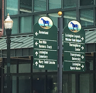
| Horse-Town Lexington, KY (Photo: Philipsen) |
Good wayfinding signs express pride, just like a hood ornament on a car.
A high-functioning wayfinding system makes the environment “legible” and enhances the visitors’ experience as it increases their comfort, builds their confidence, and encourages them to discover unique events, attractions and destinations on their own. (ASLA blog)
 |
| Phoenix wayfinding |
Leading a city to control its own story includes branding, information and reducing anxieties. It is a tall order for a city which induces
a lot of anxieties for a lot of reasons. Why not reduce one fear, that of not being able to find your way?
Klaus Philipsen, FAIA
 |
| Baltimore wayfinding:lettering is lost (Photo: Philipsen) |
 |
| US wayfinding outside Interstates is always cryptic |
 |
| San Diego wayfinding: Baltimore was on teh right track with blue and green |
No comments:
Post a Comment